We’ve seen how to simply create NavigationView and NavigationLink in SwiftUI to allow you to push and pop screens. Now, we look at how we can set the title, change the navigation bar color and the back button etc.
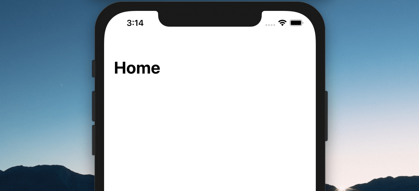
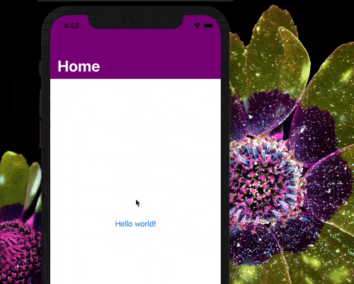
To set the title for navigation bar of your app, all you have to do is call the built-in modifier function, navigationTitle of the view that’s inside the NavigationView as follows:
NavigationView {
    Text("Hello world")
   .navigationTitle("Home")
}
Please note that the navigationTitle modifier function must be used with the View that is inside the NavigationView.
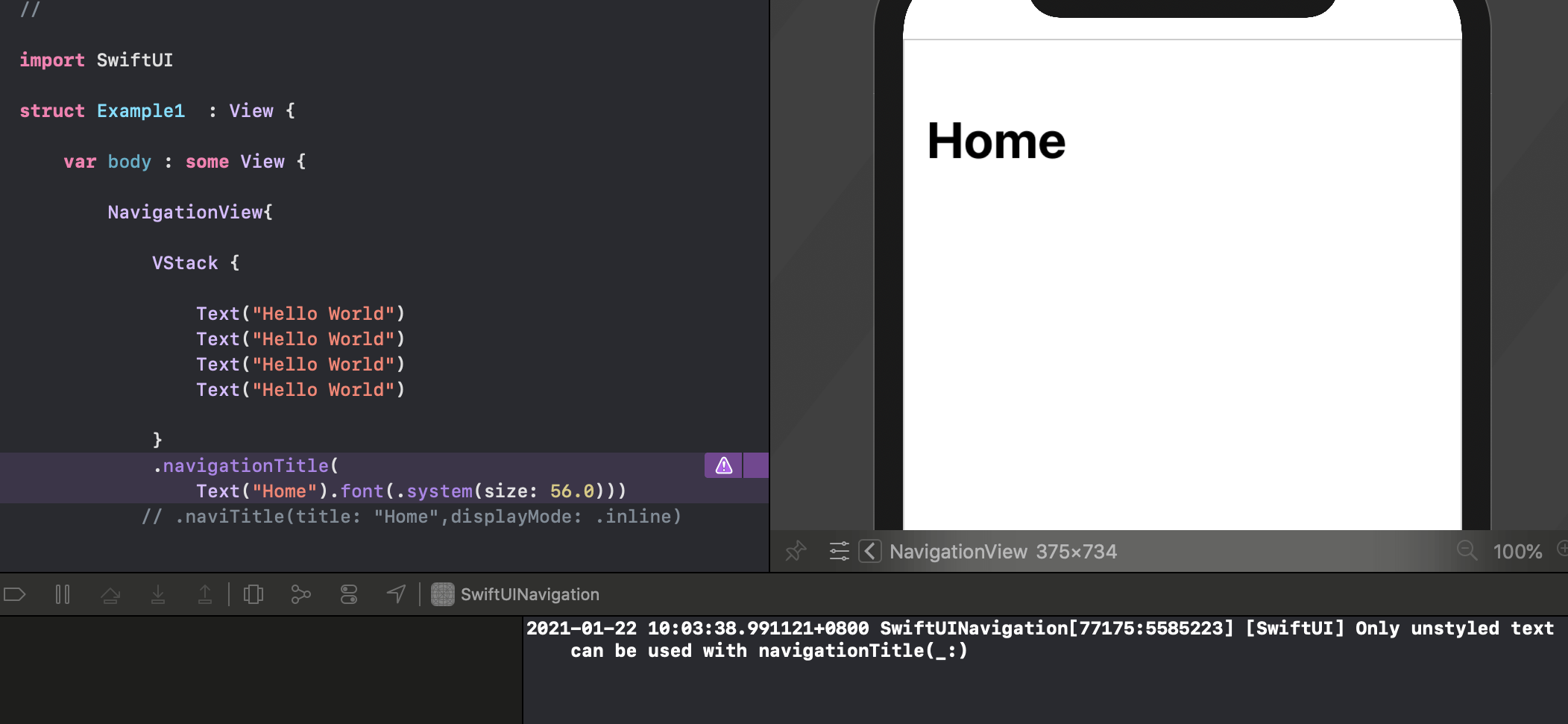
The navigationTitle() modifier can also have a Text view as its parameter, such as:
Text("Hello World")
.navigationTitle(Text("Menu"))
You’d have thought that you’d be able to style the Text view by changing its font or color. But, unfortunately, it’s not! If you do that, when it’s run, there will be a warning message of “Only unstyled text can be used” :
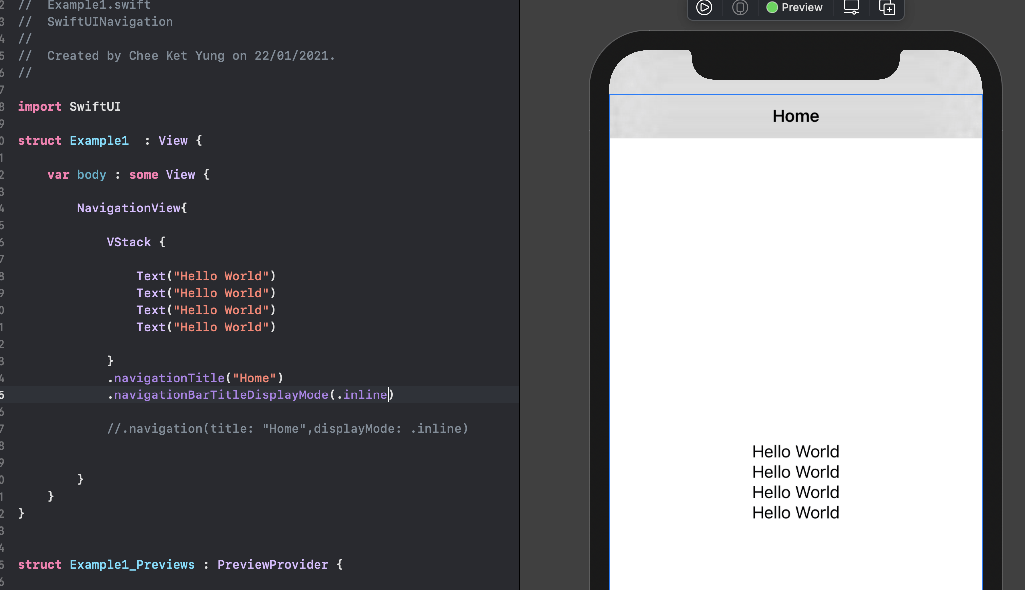
You can change the display mode of the navigation title by using the built-in modifier function navigationBarTitleDisplayMode(). The default value for the display mode is automatic, i.e. a large title will be displayed. The other two options are .large and .inline. An example of inline displayMode of the navigation bar title is as follows:
NavigationView {
    Text("Hello world")
   .navigationTitle("Home")
   .navigationBarTitleDisplayMode(.inline)
}
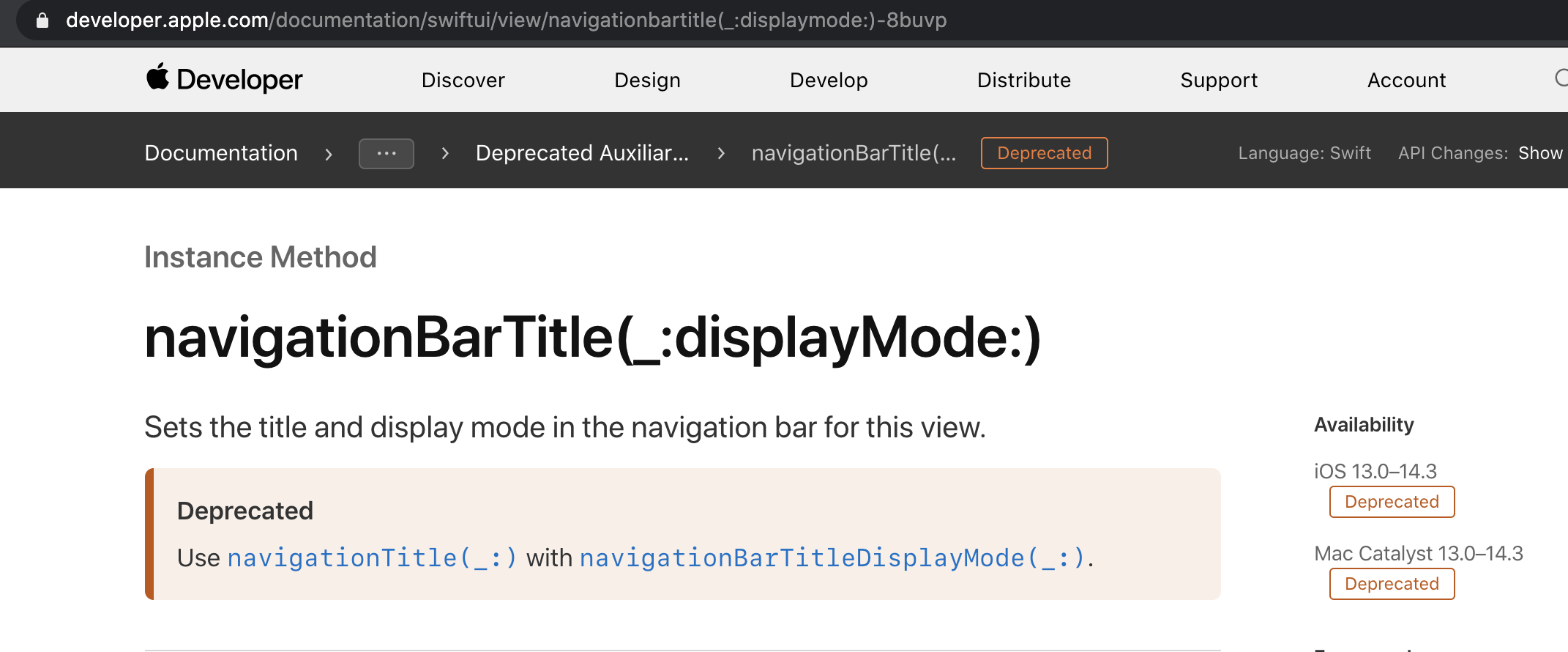
Please note that both the navigationTitle() and navigationBarTitleDisplayMode() are only available since iOS 14. For iOS 13, you’ll need to use the modifier navigationBarTitle(_:displayMode:), but this is deemed deprecated now according to Apple’s documentation since iOS 14.
In order for your app to support iOS 13 and above, we can build a custom modifier for the convenience of use as follows. You can read more about our tutorial on custom modifier, if you’re unfamiliar with it.
struct NaviBarVersionModifier : ViewModifier {
    var title : String
    var displayMode: NavigationBarItem.TitleDisplayMode

    @ViewBuilder
    func body(content: Content) -> some View {

        if #available(iOS 14, *) {
             content
            .navigationTitle(title)
            .navigationBarTitleDisplayMode( displayMode)
        }
        else {
            content.navigationBarTitle(title,displayMode: displayMode)
        }
    }
}
The above custom modifier uses #available attribute to check the iOS version. It will use navigationTitle and navigationBarTitleDisplayMode if iOS 14 is available, else will use navigationBarTitle instead.
Please note the function “body” has a @ViewBuilder attribute in order for it to return an opaque type with conditions. You can read more about our tutorial on @ViewBuilder attribute.
And we create an extension function of View as follows for convenience.
extension View {
    func navigation (title : String ,
      displayMode : NavigationBarItem.TitleDisplayMode = .automatic) -> some View{

        self.modifier( NaviBarVersionModifier(title: title, displayMode: displayMode))
    }
}
So, we can just use our custom modifier as below:
NavigationView{
    Text("Hello world!")
    .navigation(title: "Home",displayMode: .inline)
}
How to change the navigation bar color and the title color?
To change the color of the navigation bar and the title text, we can use UINavigationBarAppearance, which is available since iOS 13.
We hereby make a class Theme with a static method as follows, which will come in handy when we need it for some setup in our View or elsewhere.
class Theme {
    static func navigationBarColors(background : UIColor?,
       titleColor : UIColor? = nil, tintColor : UIColor? = nil ){

        let navigationAppearance = UINavigationBarAppearance()
        navigationAppearance.configureWithOpaqueBackground()
        navigationAppearance.backgroundColor = background ?? .clear

        navigationAppearance.titleTextAttributes = [.foregroundColor: titleColor ?? .black]
        navigationAppearance.largeTitleTextAttributes = [.foregroundColor: titleColor ?? .black]

        UINavigationBar.appearance().standardAppearance = navigationAppearance
        UINavigationBar.appearance().compactAppearance = navigationAppearance
        UINavigationBar.appearance().scrollEdgeAppearance = navigationAppearance

        UINavigationBar.appearance().tintColor = tintColor ?? titleColor ?? .black
    }
}
Basically, the above static method simply set the background color (e.g. purple), the title text attributes for both inline and large title and the tint color. The tint color will be set the same as the title text color, if it’s not specified. The tint color is what affects the back button’s color.
Please note that, we only set the title text attribute with the foreground color only, you can also extend it to be able to set the font as well.
So, for any View that we need to have a colored navigation bar and title, we can just call the above static method in its initializer as follows :
struct Menu : View {
    init(){
       Theme.navigationBarColors(background: .purple, titleColor: .white)
    }

    var body : some View {
       EmptyView()
    }
}
Please note that the View that you push to will follow having the same navigation bar color, title and tint color. And the result is as below:
How to have a custom back button for navigation bar?
You’d have noticed the back button on the navigation bar is a standard back arrow and a text which is the title of the previous screen. You may not like it such as you may want to eliminate the text or have your own custom back button. So how to do that?
First of all, we need to use the built-in modifier navigationBarBackButtonHidden to hide the default back button:
var body: some View {
Text("View 2")
.navigationBarBackButtonHidden(true)
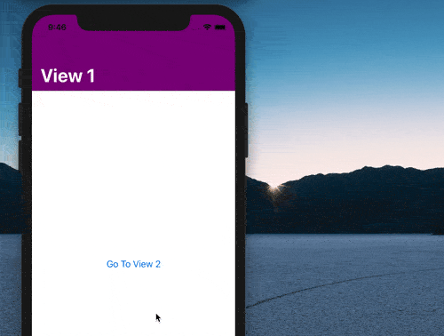
}And in iOS 14, a toolbar has been introduced which can be used as a modifier for any View to contain ToolbarItems. A ToolbarItem that is to be used on a navigation bar, should be specified with a placement as navigation and it can have any View wrapped inside it :
@Environment(\.presentationMode) var presentation

var body: some View {
   Text("View 2")
   .navigationBarBackButtonHidden(true)
   .toolbar(content: {
      ToolbarItem (placement: .navigation)  {
         Image(systemName: "arrow.left")
         .foregroundColor(.white)
         .onTapGesture {
             // code to dismiss the view
             self.presentation.wrappedValue.dismiss()
         }
      }
   })
}
In the above code, we have a ToolbarItem that wrap around an Image view of SF Symbol and we will programmatically dismiss the view inside its onTapGesture modifier.
SwiftUI exposes a range of pre-defined environment properties, one of them is the presentationMode. The presentationMode tells if a View is presented and has function to dismiss the view.
So, we use the @Environment(.presentationMode) property wrapper to link our variable “presentation” to the presentationMode. To dismiss the view programmatically, we just need to the line of code as below or as in line 12 in the above :
self.presentation.wrappedValue.dismiss()The result is as below:
Toolbar is only available in iOS 14+ and is still in its beta version at the time of this writing according Apple’s documentation.
If you want to have your app to support iOS 13, you’ll have to use the navigationBarItems modifier as follows, the toolbar portion of the code is now replaced by using navigationBarItems modifier.
@Environment(\.presentationMode) var presentation

var body: some View {
   Text("View 2")
   .navigationBarBackButtonHidden(true)
   .navigationBarItems(leading:
       Image(systemName: "arrow.left")
       .foregroundColor(.white)
       .onTapGesture {
          self.presentation.wrappedValue.dismiss()
       }
    )
}
But navigationBarItems is now deemed deprecated according to Apple’s developer documentation and you’re asked to use toolbar instead. So, for the convenience of use, it’s advisable to create your own custom modifier to check the version of iOS to determine what to use.
That’s all for now. Hope you enjoy this tutorial and happy learning!
One thought on “Navigation bar title style, color and custom back button in SwiftUI”