Python has an awesome library known as Matplotlib, which you can use to create all sort of graphs and charts by simply a few lines of code.
The matplotlib does not come by default with your Python installation. If you don’t have it, you’ll need to install it by the following command
python -m pip install matplotlibHere are a few quick example of charts that it can create for you.
1. Line chart
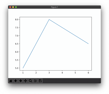
import matplotlib.pyplot as plt
plt.plot([1, 3, 6], [5, 8, 6.5])
plt.show()
2. Bar chart
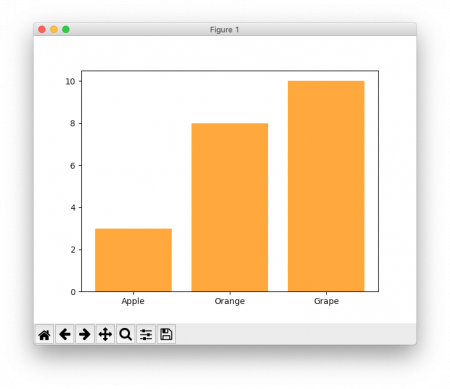
import matplotlib.pyplot as plt
plt.bar(['Apple','Orange','Grape'], [3, 8, 10], color = '#FF9922')
plt.show()
3. Pie Chart

import matplotlib.pyplot as plt
plt.pie([3, 8, 10],  labels =  ['Apple','Orange','Grape'], colors = ["#334455", "#FFAA34", "#508932"])
plt.show()
4. Histogram – the kind of graph that shows frequency distributions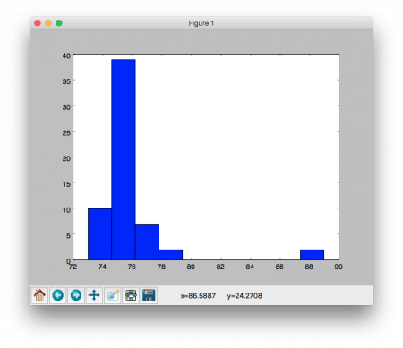
import matplotlib.pyplot as plt
plt.hist([76, 77, 75, 76, 75, 74, 76, 76, 78, 74, 76, 76, 74, 76, 74,
  77, 76, 76, 74, 75, 77, 75, 75, 76, 75, 77, 76, 74, 75, 75,
  74, 76, 77, 75, 73, 75, 77, 75, 75, 76, 74, 76, 76, 75, 76,
  75, 75, 75, 76, 74, 88,89, 76, 76, 76, 78,77,76,76, 76])
plt.show()
Line 2 – to create a histogram, simply call the method hist() and supply it with a parameter of an array of numbers. E.g, the above shows the distribution of scores of math test in a class of 60 students.
More info about Matplotlib can be found on here