
SwiftUI View comes with a range of built-in modifiers, such as background(), frame(), cornerRadius(), shadow() etc, which allow you to change the view from its original appearance or behaviour. Besides the built-in modifiers, you can also create your own custom modifiers.
To create a custom View modifier, we just need to create a struct that conforms to the ViewModifier protocol and implement the function “body” as below:
struct ShadowedRoundCorner : ViewModifier{
    func body(content : Content) -> some View{
        content
        .padding()
        .background(Color.white)
        .cornerRadius(30)
        .shadow(radius: 20 )
    }
}
The parameter “content” of the function is the original version of the View, which you can apply it with a combination of modifiers, wrap it around a stack or container or apply it with some animations or effects etc.
In this tutorial, we’ll show you two examples:
Example 1 is how to combine several modifiers that you often need to apply on many views into a custom modifier for better reusability.
Example 2 is how to create reusable view components with custom modifier.
Example 1 – Combine several modifiers into a custom modifier for reusability
The above example is which we apply a combination of modifiers to give a View with default padding, a white background, with rounded corner and shadow.
If you always need to repeat applying the same several effects on many views or view types throughout your app, it’s better to create a custom modifier for better code reusability.
So, with the above view modifier, we can just use it with a built-in modifier, which is also called modifier() as follows:
Text("Have a nice day")
.modifier(ShadowedRoundCorner())
And it’s always a good idea to create an extension of View, with a convenient function – let’s just call it roundIt() for simplicity here :
extension View {
    func roundIt(){
       self.modifier(ShadowedRoundCorner())
    }
}
So, we can just use it as follows with any View
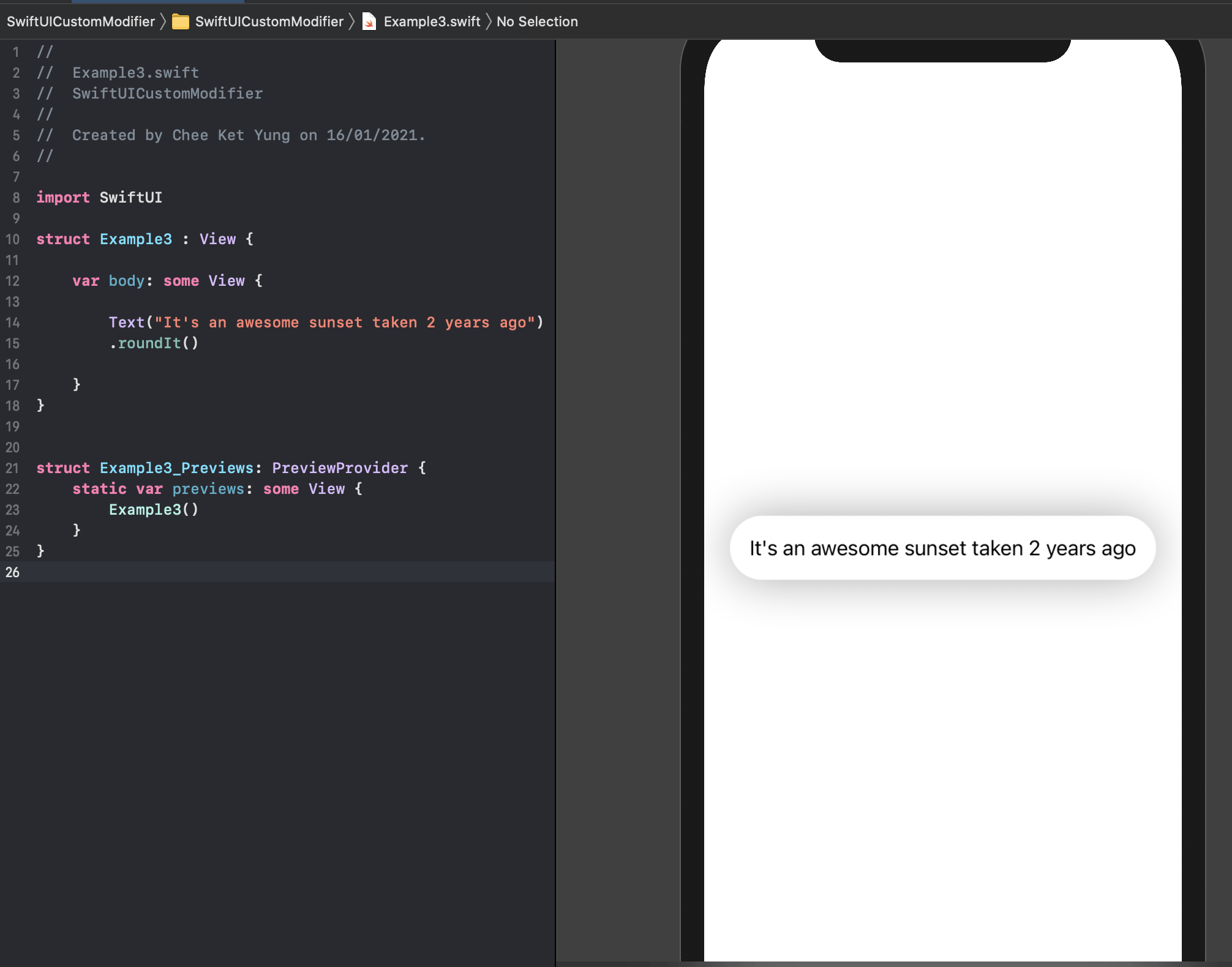
Text("It's an awesome sunset taken 2 years ago")
 .roundIt()
And the result :
Example 2 – Create reusable view components with custom modifier e.g. create a custom ProgressView
Using custom modifier is also a smart way to build reusable view components. Since ProgressView is only available since iOS 14, we take this opportunity to create a custom progress view which comes in handy to be used as a custom modifier for iOS 13 and above.
For simplicity, we’ll firstly build a custom yet simple activity indicator, which presents you a colored dot repeatedly moving from position one to position three and then back to one; indicating there is an on-going activity, as below:

We simply have a HStack of 3 Circles, which each Circle will appear as the specified color (e.g. purple) when the @State mutable variable “position” is 0, 1, 2 respectively.
A Timer is used inside the HStack onAppear to repeatedly changing the position from 0 to 2 by calling the changePosition() function, with an interval of 0.5 second.
And when the “isRunning” variable is false, the Timer will be invalidated. Please note that the isRunning variable has the property wrapper @Binding.
@Binding is a useful property wrapper in SwiftUI to pass data in two ways from a parent view that creates or instantiates a child view. So, a change of the value of the variable either in the parent or the child will reflect both in the parent and child.
struct CustomActivityIndicator : View {
    var color : Color
    @Binding var isRunning : Bool
    @State private var position : Int = 0

    var body : some View {

        HStack (spacing: 10){

            Circle()
            .fill( (self.position == 0) ? self.color : Color(UIColor.lightGray) )
            .frame(width: 30, height: 30)

            Circle()
            .fill( (self.position == 1) ? self.color : Color(UIColor.lightGray)  )
            .frame(width: 30, height: 30)

            Circle()
            .fill( (self.position == 2) ? self.color : Color(UIColor.lightGray)  )
            .frame(width: 30, height: 30)

        }
        .onAppear{
             Timer.scheduledTimer(withTimeInterval: 0.5, repeats: true) { timer in
                withAnimation{
                    self.changePosition()
                }

                if !self.isRunning {
                    timer.invalidate()
                }
             }
        }
    }
}
The changePosition() function:
extension CustomActivityIndicator {
    private func changePosition(){
        if self.position < 3 {
            self.position += 1
            if ( self.position == 3 )
            {
                self.position = 0 // reset to zero when it's reached 3
            }
        }
    }
}
So now we create our custom modifier. The custom modifier will present a custom ProgressView, which appears on the frontmost layer of a ZStack :
struct ProgressViewModifier : ViewModifier {
    @Binding var isShowing : Bool

    var text : String
    var size : CGSize
    var color : Color

    func body(content: Content) -> some View {

        ZStack { content

            if isShowing {
                withAnimation {
                    showProgressView()
                }
            }
        }
    }
}
In the above, the content is embedded in a ZStack, which will call the showProgressView() function when the isShowing is true. This is similar to our previous tutorial on how to to create a custom popup View
For better code readability, we have the popup ProgressView coded in an extension function showProgressView(). It simply presents a VStack with our CustomActivityIndicator and a Text view as follows:
extension ProgressViewModifier {
    private func showProgressView() -> some View {
        VStack (spacing : 20) {

            CustomActivityIndicator(color: self.color,
              isRunning: self.$isShowing)

            Text(text)
            .foregroundColor(.black)
            .font(.headline)
        }
        .frame(width: size.width, height: size.height)
        .background(Color.white)
        .cornerRadius(30)
        .shadow(radius: 20 )
    }
}
Please note that above, the isShowing variable also has the @Binding property wrapper. And the isRunning variable of the CustomActivityIndicator is connected by the isShowing variable of the ProgressViewModifier - as we want the CustomActivityIndicator to start running, when the custom ProgressView is presented.
Now, we can create a convenient extension function progressView() of View as follows, the text, size and color are given a default value :
extension View {
    func progressView(isShowing: Binding <Bool>,text : String = "Loading...", size : CGSize =
    CGSize(width:160, height:160), color : Color = .purple) -> some View{
        self.modifier(ProgressViewModifier(isShowing: isShowing, text: text, size: size, color: color))
    }
}
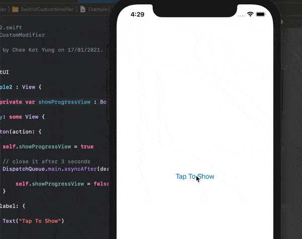
So, the above custom modifier can be just used with any View. Such as below, we simply create a Button, which will set the @State showProgressView variable to true when it's tapped and will set it to false after 3 seconds :
struct Example2 : View {
    @State private var showProgressView : Bool = false

    var body: some View {

        Button(action: {

            self.showProgressView = true
            // close it after 3 seconds
            DispatchQueue.main.asyncAfter(deadline: .now() + 3.0) {
                self.showProgressView = false
            }

        }, label: {
            Text("Tap To Show")
        }) // the custom modifier progressView
        .progressView(isShowing: self.$showProgressView)
    }
}
The result :
That's all for now. Hope you'll enjoy this tutorial and happy learning. The complete source code of this tutorial can be found on GitHub.
2 thoughts on “How to create custom View modifiers for better code reusability in SwiftUI”